
Cover ?| ?Archive ?| ?Crime ?| ?Fantasy/SF ?| ?Popular ?| ?Historical ?| ?Comics ?| ?Non-Fiction ?| ?Children's ?| ?
Table of Contents ?????????????????????????????????????????????????????????????????Open for debate
?
?
Reviews
?
?
Feature Articles
?
 Introducing the Original Dangerous Books for Boys
Nostalgia: Things are what they used to be!
Nostalgia Central: Carlton Books
Elizabeth Chayne's Reading Room
Personalised Noddy Books from Harper Collins
?
Stories and Serials
?
Phyllis Owen: A Soft White Cloud Chapter Four
Paul Norman: Heraklion ~ Outcast
?
Judging a Book by its Cover
By Paul Norman
Did you guess correctly? Which of the five covers on the home page was not one of Hodder's Yellow Jacket reprints? Answer at the bottom of the page. Nowadays a?publisher decides on the cover of a book with only one purpose in mind - to assist in the selling of the book. In the 19th century, books for the masses were relatively new and more often than not had a cover that bore only the title and the name of the author, sometimes the name of the publishing house that was issuing it. In the early years of the 20th century, however, a quiet revolution took place, fuelled in part by the publication of adventure and science fiction novels that used illustrations in a way that had begun with titles such as Alice's Adventures in Wonderland.
 Gradually, the big publishing houses in the 1900s started to use illustrated covers. As more and more people took up reading and became literate, the covers became more of an indicator of what might lie inside the pages of the book, and were consequently used as a selling tool, a marketing device. For a time, hardback books had their cover illustrations impressed on the covers, or embossed, as an integral part of the binding.
 Then the dustjacket arrived, and book cover designs really started to take off big time. In the 1920s, for example, Hodder and Stoughton "Yellow Jacket" dustjackets started to appear with highly stylised and impressionable covers, often depicting scenes from the stories. For the next forty years or so, book covers, many designed by top artists, took a scene from the story and illustrated it. Thus, for example, an Edgar Rice Burroughs John Carter novel would show the princess Dejah Thoris in a suitable state of undress, being rescued from a green Thark by John Carter.

 The first paperbacks arrived in the late 1930s, with Allen Lane's Penguins. They had minimalist designs, which have just been resurrected in a series of limited edition books. The crimes were green, the general fiction were orange, and so on. Once Penguins had established a vibrant paperback market, the rest of the publishers followed suit.
?
It was in the 1960s that everything started to go wrong. This is, of course, a personal opinion, but in the psychedelic 1960s, anything went. It's impossible to blame one person, though a few names do spring to mind, and here we'd have to differ in our opinions of what makes good and bad art. If we skip forward to the current decade, things have gone full circle. Not only are publishers like Hodder reissuing selected "yellow jackets" with all their cover glory, but also, picking up a novel often provides the added bonus of a glorious cover by someone like Steve Stone, Dominic Harman, Mark Thomas et al.
?
 |
 |
 |
 |
Steve Stone's amazing covers for Steven Erikson's MALAZAN EMPIRE series |
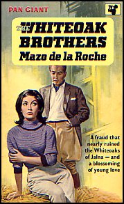
 I say "often" because there are still some designs out there that don't really provide any indication of what's inside the book. Photo-realism is another overworked area, especially in the realms of the saga. Take this illustration, from Rosie Harris (Random House)??and contrast it with a "saga" book from the 1950s/1960s, Mazo de la Roche's WHITEOAK BROTHERS 1962 (Pan Books) and tell me which one you prefer. So what did go wrong? I suspect that in part, it's the fault of the establishment, the same establishment that awards massive pecuniary prizes to people with non-existent artistic talent (The Turner Prize) and a liberal teaching establishment that won't allow an "artist" to be castigated for turning out poo, but insists that everything, no matter how bad, has its merits. I do not subscribe to that school. I love to listen to Brian Sewell, but even he cannot persuade me that the later works of Picasso are anything remotely approaching art - I want my painted people to look like people, and that's an end to it.
So, in the 1960s, when everything went downhill and the liberals escaped from the asylum and took over the world, the area of book cover design took a downward shift and went from glorious to absolute sh**te in what now seems like a matter of weeks. If that wasn't bad enough, fantasy and science fiction went off in one direction, with the shatteringly brilliant covers by Boris Vallejo and Frank Frazetta, while the rest went down the Space:1999 route, with grotesquely modern lettering that had no saving graces whatever, and crude pictures; by crude I mean, of course, that they were amateurish, boorish, and just simply poor. The most effective way of illustrating what I mean is to provide you with some illustrations.
 |
 |
 |
 |
In both cases, the 1950s/1960s cover is?on the left, the right-hand covers in each case come from the creatively-barren 70s and 80s.
Answer: It was "Featuring the Saint", but watch this space, as they say!
?
Gateway is published by Paul Edmund Norman on the first day of each month. Hosting is by Flying Porcupine at www.flyingporcupine.com - and web design by Gateway. Submitting to Gateway: Basically, all you need do is e-mail it along and I'll consider it - it can be any length, if it's very long I'll serialise it, if it's medium-length I'll put it in as a novella, if it's a short story or a feature article it will go in as it comes. Payment is zero, I'm afraid, as I don't make any money from Gateway, I do it all for fun! For Advertising rates in Gateway please contact me at Should you be kind enough to want to send me books to review, please contact me by e-mail and I will gladly forward you my home address. Meanwhile, here's how to contact me:
Web hosting and domain names from Vision Internet?
?